
Adaptive technology
Adaptive technology may refer to any of the following.
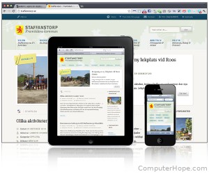
1. Adaptive web design is a technique for designing a website or web application so that its design adapts depending on the device used to view it. For example, a website having one design style for desktop computer browsers, another for smartphones, and another for tablet devices, is classified as using adaptive web design.
Adaptive web design is similar to, but more rigid than, responsive web design. In responsive web design, the website is designed to change its layout dynamically based on changes the user makes to the display after the browser loads the page. For example, if the user rotates their phone or resizes their browser window, and the website layout changes in response, that is responsive web design.
As a rule of thumb, if the web server provides a different page based on the device type or window size, that is adaptive web design. If the web page changes layout after the web page is loaded in response to a change in display size or orientation, that is responsive web design.
How and why adaptive web design is useful
Designing a web page has a lot in common with traditional graphic design. Text, photographs, and illustrations must be presented in a way that is appealing to the eye, easy to read, and logically organized.
In a traditional print layout, the size of the page never changes. But the dimensions of a web page (the number of pixels for length and width, e.g., 800 x 600) is dynamic. Ideally, two people reading the same web page on different computers should have similar experiences. If the browser window is resized, the layout of the page should adapt. And, what if the reader wants to view the web page on a mobile device? On the web, the size of the page is not guaranteed, and this must be factored in to any successful design.
Using adaptive web programming techniques, a web page can dynamically adapt its layout style and dimensions based on the operating system, Internet browser, and the display size. This becomes especially important when designing web pages that are viewed on a computer, and a tablet device and a smartphone. For each of these three viewing platforms, the rendered size and aspect ratio of a web page differs.
Adaptive programming enables the web page content to resize with the browser window. Not only will content re-flow and resize to fit the new dimensions, but UI (user interface) elements can change. Menus may appear or disappear to suit a new viewing format, or change from text to small icons to conform to a smaller portion of the page.
If the page design formats its data in columns (similar to the columns in a newspaper), adaptive programming can enable the number of columns to change dynamically.
2. In general, artificial intelligence and machine learning are considered adaptive technologies. These systems iterate upon, and repeatedly modify their own algorithms. They adapt to a continuous stream of ever-changing input, to improve the analysis and prediction of real-world events, and other functions reliant on changing variables.
Artificial intelligence terms, Pixels, Programming terms, Web page