
Saturation
Also known as chroma or intensity, saturation is a color quality determined by a mixture of light intensity and the distribution across different visible spectrum wavelengths. For instance, the highest saturation point for a color only spans one wavelength.
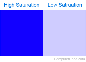
More plainly, saturation is how intense a color appears to the human eye; a highly-saturated color appears more vivid. For example, imagine you have a can of bright blue paint. If you mixed in some pure white paint, the overall color would change to a softer, more pastel blue, a decrease in saturation. The image helps illustrate this concept.
The saturation of colors can be adjusted on most modern monitors and televisions, and in graphic editing programs like Adobe Photoshop and GIMP (GNU image manipulation program). At 100% saturation, the color is fully intense and vibrant. At 0% saturation, the color becomes a shade of gray, completely devoid of its pure hue.
When describing the HSL (hue, saturation, and lightness) color space a light and dark color can both have a high saturation.