A few days ago, I noticed that many of the things displayed on websites stopped displaying like they used to. This includes text (As I type this, the letters are all smaller, have screwy spacing between letters as well as words, and they move of their own accord while typing every now and then), images, highlighting is off, and just the general set up of the sites seem to be thrown off. I can't really explain what it's like, so I'll try to use some pictures to help you figure this thing out (Assuming you want to, of course).
Here's the buttons located at the top of this very site. The images are so small, and I don't think they're supposed to be.
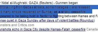
This is what I get if I try to highlight text. Notice where I stopped highlighting. It cuts right through that "h." Though it's actually worse than that. I'm highlighting a bit to the left of there, but it doesn't show the highlighting correctly.

Here I am looking at an upcoming book from Wizards of the Coast. See the words going into the picture? And the little bulleted links are screwy, too. If I go back there, it sometimes comes out alright. Here's the actual site:
http://www.wizards.com/default.asp?x=products/dndacc/107627200
Here's a log in screen. Things aren't lining up as they should.

Here's an e-mail I received in Gmail. That highlighting should be over the word "Wii."
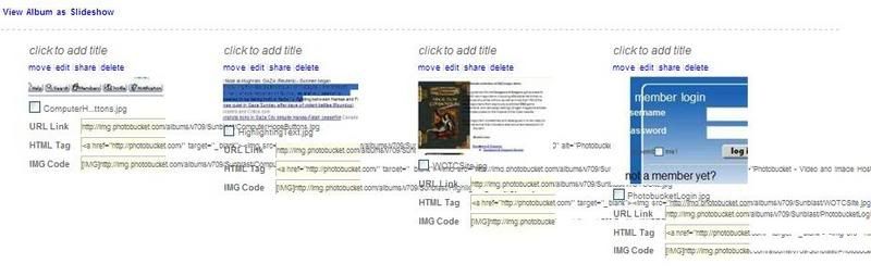
And here's where I'm storing these images. It's a mess!
I think I know how I started this. When typign up a message for a forum, I needed the little degree symbol (When saying 360 degrees), so I went into Word and inserted it as a symbol, then copied and pasted it into my message. Right then, things got warped and it hasn't been the same sense. I'd say that's probably when it started.
Any advice, guys? It's driving me crazy!
-Sunblast

