How to create a responsive website using CSS Grid and Flexbox
This example implements a responsive website design using CSS (cascading style sheets), HTML (hypertext markup language), and JavaScript. The layout has two variations, suitable for both desktop browsers and mobile devices.
Basic setup
Begin with index.css and index.html from the Grid CSS holy grail layout.
Place index.css and index.html in the same folder. Open index.html in a web browser.
Layout design
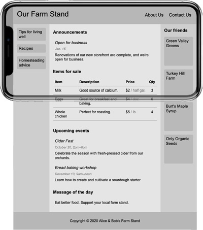
Our example shows one way to create the home page for a fictional business/service. The home page is the first thing the user sees when visiting the site.
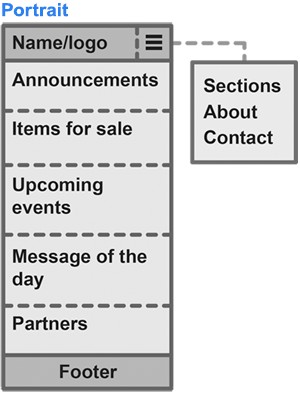
Content outline
The primary information to appear on the home page is listed below.
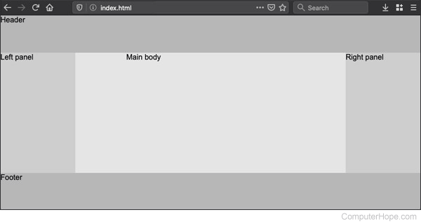
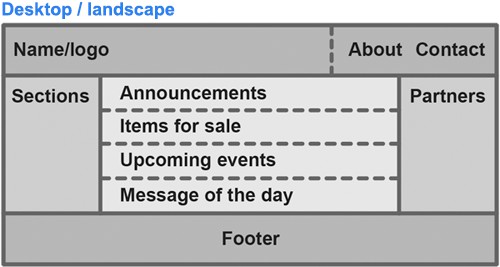
- Name/logo — The identity of the business/service, located in the header, left justified.
- Announcements — The first section of the main body. The user sees this information above the fold, before seeing items for sale. This space may contain important updates, limited-time deals, or recommended items.
- Items for sale — The name, description, price, and current inventory of various items for sale.
- Upcoming events — Information about future business-related events where the user may want to participate.
- Message of the day — Rotating "flavor" content, such as a quiz or an inspirational quote.
- Footer — Authorship or Copyright information.
Subcontent outline
The following links and supplemental information are accessible on the home page, encouraging the user to explore. This subcontent may appear differently in the layout, depending on the user's viewing device.
- On a desktop browser or a mobile device in landscape mode, all subcontent is displayed.
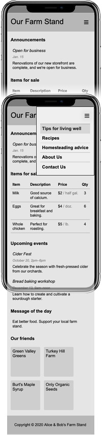
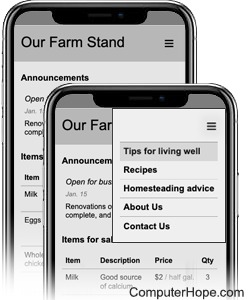
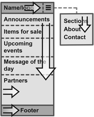
- On a mobile device in portrait mode or a desktop browser window resized narrow, the side panels disappear. Subcontent is repositioned or available in a menu.
The following subcontent is accessible on the home page.
- About — A link to a separate identity statement page. In desktop/landscape mode, it appears in the header, justified right. In portrait mode, it is a menu item.
- Contact — A link to a separate page with contact information of the business/service, such as a postal address, e-mail address, phone number, etc. In desktop/landscape mode, this link appears in the header, justified right. In portrait mode, it is a menu item.
- Sections — Links to other sections of the website. In portrait mode, each section link is a menu item.
- Partners — Links to partner businesses/services. In desktop/landscape mode, partners are displayed in the right panel. In portrait mode, they are displayed at the bottom of the main body.
Layout diagram
This design has two layout variations.
- One layout for devices in landscape mode.
- One layout for devices in portrait mode.
Desktop browsers are compatible with both, but primarily view the landscape layout.
The layouts are diagrammed as follows.
HTML elements
In this design, the following HTML elements are each assigned a specific layout purpose.
| Element | Purpose |
|---|---|
| <div> | The division or div element is a fundamental building block of the layout. The entire page is contained in a div, including the component grid items (header, panels, main body, footer). A div can contain another div. |
| <section> | Contains a unique section of information, such as "Announcements," "Items for sale," etc. In this layout, the main body is implemented as a section of sections. |
| <h1> | Largest heading text, used for the name of the website. |
| <h2> | Large heading text, used for the nav items (About, Contact). |
| <h3> | Medium heading text, used for section headings (Our friends, Announcements). |
| <h4> | Small heading text, used for content titles (Open for business, Cider fest). |
| <p> | A paragraph of text expected to flow to the next line. |
| <span> | A range of alternate-styled text that doesn't break the paragraph. |
| <table> | Tabular information arranged in rows and columns, such as the items for sale. |
Flexbox
CSS Flexible Boxes (abbreviated as Flexbox) is a set of special CSS attributes. It creates elements that expand or contract ("flex") automatically, depending on their content and layout context.
An element with attribute display: flexbox is a flexbox container. If the container shape changes (e.g., if the user resizes the browser window, or rotates their mobile device), its child elements change their relative position or shape. The elements flex in one dimension, either horizontally (in a row) or vertically (in a column).
The holy grail layout has five major areas that flex.
- The header and footer flex horizontally (flex-direction: row), left-to-right.
- The left panel, main body, and right panel flex vertically (flex-direction: column), top-to-bottom.
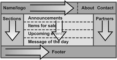
In portrait mode, the panels are hidden. The menu is implemented as a flex column.
Implementation: CSS, JavaScript, and HTML
CSS: index.css
/* element styles */
* {
  margin: 0;     /* by default, all elements (selector *) have no margin */
}
html {
  width: 100%;                    /* 100% width of parent (root) element */
  height: 100vh;                              /* 100% height of viewport */
  background: rgb(0, 0, 0, 0.1);                            /* 10% black */
  font-size: 1.0em;                                /* our root font size */
  font-family: Arial, Helvetica, sans-serif;             /* default font */
}
body {
  min-height: 100%;
}
section {
  padding: 0.5rem;
  flex-grow: 1;         /* in a flexbox, sections expand along flex axis */
}
h1 {                                           /* Website name in header */
  font-size: 2.0rem;
  font-weight: normal;
}
h2 {                                                   /* About, Contact */
  font-size: 1.25rem;
}
h3 {                                                 /* Section headings */
  font-size: 1.2rem;
  padding: 0.5rem;
}
h4 {                                               /* Section item title */
  font-weight: normal;
  padding: 0.5rem;
}
p {                                                 /* Paragraph styling */
  padding: 0.5rem;
}
a:link, a:visited {            /* anchor links, and visited anchor links */
  color: black;
  text-decoration: none;                            /* disable underline */
}
a:hover {                                 /* when anchor link is hovered */
  color: rgb(25, 25, 25);
}
a:active {                                /* when anchor link is clicked */
  color: rgb(96, 96, 96);
}
/* component styles */
#container {
  display: grid;
  height: 100%;
  grid-template-columns:
    [left] 10rem auto 10rem [right];
  grid-template-rows:
    [top] 5rem auto 5rem [bottom];
  grid-template-areas:
    "head head head"
    "panleft mainbody panright"
    "foot foot foot";
}
#header {
  grid-area: head;                  /* corresponds to grid-template-area */
  background: rgb(0, 0, 0, 0.2);                            /* 20% black */
  display: flex;
  flex-direction: row;
  justify-content: space-between;
  align-items: baseline;  /* site name and nav item text aligns baseline */
  padding: 1.0rem;
}
#panel {                                        /* if element id="panel" */
  display: flex;                     /* this element is a flexbox parent */
  flex-direction: column;          /* its child elements flex vertically */
  padding: 0.5rem;
  background: rgb(0, 0, 0, 0.1);                            /* 10% black */
}
#panel.left {                  /* if element id="panel" and class="left" */
  grid-area: panleft;                  /* this element fills a grid area */
}
#panel.right {                /* if element id="panel" and class="right" */
  grid-area: panright;                 /* this element fills a grid area */
}
#footer {                                      /* if element id="footer" */
  grid-area: foot;                     /* this element fills a grid area */
  display: flex;                     /* this element is a flexbox parent */
  flex-direction: column;          /* its child elements flex vertically */
  justify-content: center;           /* horizontal center footer content */
  align-items: center;                 /* vertical center footer content */
  padding: 0.5rem;
  background: rgb(0, 0, 0, 0.2);
}
#mainbody {                                  /* if element id="mainbody" */
  display: flex;                     /* this element is a flexbox parent */
  flex-direction: column;          /* its child elements flex vertically */
  grid-area: mainbody;
  justify-self: center;          /* fixed-width mainbody always centered */
  width: 100%;
  min-width: 22.5rem;               /* mainbody width can't go < 22.5rem */
}
div#panel,
div#mainbody {                               /* extra space under header */
  padding-top: 0.5rem;
}
#partners, #sections {      /* if element id="partners" or id="sections" */
  display: flex;                     /* this element is a flexbox parent */
  flex-direction: row;           /* its child elements flex horizontally */
  flex-wrap: wrap;           /* its child elements can wrap to next line */
  align-content: flex-start;       /* child elements start in upper left */
}
#partners.wide {            /* if element id="partners" and class="wide" */
  display: none;              /* by default, do not display this element */
}
#menu {
  position: absolute;      /* menu position unaffected by other elements */
  right: 0;                       /* zero pixels from the right boundary */
  background: rgb(239, 239, 239);
  border: 0.15rem solid rgb(0, 0, 0, 0.4);
  visibility: hidden;        /* visibility property supports transitions */
  opacity: 0;      /* opacity + visibility transition = menu fade effect */
  z-index: 1;              /* ensure menu appears over all other content */
}
#menuitems {               /* menu is implemented as a flexbox container */
  display: flex;
  flex-direction: column;
  padding: 1rem;
}
#menuitems h3 {
  border-top: 0.15rem solid rgb(0, 0, 0, 0.1);  /* light horizontal rule */
}
#menuitems .menusec {
  border-color: rgb(0, 0, 0, 0.25);            /* darker horizontal rule */
}
#menuitems h3:hover {
  background-color: rgb(0, 0, 0, 0.1);     /* gray of rollover menuitems */
}
.menubutton {
  text-align: right;
  cursor: pointer;            /* indicates it can be clicked like a link */
  user-select: none;            /* user cannot select the button as text */
}
#menuitems .alignright {
  text-align: right;            /* right-aligned menu item text (unused) */
}
#header h1.menubutton {
  display: none;        /* in default view (landscape), hide menu button */
  border: 0.15rem solid rgb(0, 0, 0, 0);   /* (invisible) alignment shim */
}
#header .placeholder {    /* this invisible button is rendered when menu */
  color: rgb(0, 0, 0, 0); /* button is hidden, so header height matches. */
  user-select: none;       /* user can't select text of invisible button */
}
.sectionlink, .partnerlink {
  border-radius: 0.25rem;     /* give this element a slight rounded edge */
  font-weight: normal;
  font-size: 1.1rem;
  padding: 0.5rem;
  width: 7rem;                            /* fixed width for these items */
  margin-bottom: 1rem;                  /* slight margin for readability */
  background: rgb(0, 0, 0, 0.1);
}
.sectionlink:hover, .partnerlink:hover {
  background-color: rgb(0, 0, 0, 0.065);   /* brighten bg on mouse hover */
}
.partnerlink {
  height: 7rem;        /* partner elements are additionally fixed height */
}
.partnerlink.wide {
  margin: 0.5rem 1rem 0.5rem 0;      /* margins for spacing if they wrap */
}
.clickable-area {      /* use whenever a clickable area excludes margins */
  height: 100%;                 /* clickable area spans height of parent */
}
.eventitem, .announceitem, .motditem {
  margin-bottom: 0.5rem;                /* slight margin for readability */
}
.title {                                    /* e.g., "Open for business" */
  font-style: italic;
  font-weight: normal;
  font-size: 1.1rem;
}
.date {                                         /* e.g., January 1, 2021 */
  font-style: italic;
  font-size: 0.9rem;
  padding: 0 0 0 0.5rem;
  color: rgb(0, 0, 0, 0.5);
}
.navitem {                                             /* About, Contact */
  font-weight: normal;
  padding: 0 0.5rem 0 1rem;
}
.headspace, .panspace, .footspace, .bodyspace {
  flex-grow: 1;      /* these elements expand on flex axis to fill space */
}
/* table styles ("items for sale") */
table {
  border-collapse: collapse;               /* pixel-adjacent table cells */
  width: 100%;
  margin-bottom: 1rem;
}
th {
  text-align: left;
}
tr {
  margin: 4rem 0 0 0;
  border-bottom: 0.15rem solid rgb(0, 0, 0, 0.2);     /* horizontal rule */
}
td, th {
  padding: 0.5rem;
  vertical-align: top;
}
td.price {
  white-space: nowrap;        /* white space in price does not wrap line */
}
td.qty, th.qty {
  text-align: center;
}
span.perunit {
  opacity: 0.5;
}
/* responsive styles applied in portrait mode */
@media screen and (max-width: 45rem) {      /* if viewport width < 45rem */
  #panel.left {
    grid-column-end: left;         /* panel grid area shrinks to nothing */
  }
  #panel.right {
    grid-column-start: right;      /* panel grid area shrinks to nothing */
  }
  #partners.tall {
    display: none;  /* hide partners in panel (overwrites display: flex) */
  }
  #partners.wide {
    display: flex;   /* show partners in body (overwrites display: none) */
  }
  #panel,                                 /* these disappear from layout */
  #header .placeholder,
  .navitem {
    display: none;
  }
  #mainbody {
    grid-column-start: left;         /* mainbody now starts at left edge */
    grid-column-end: right;           /* mainbody now ends at right edge */
  }
  #header h1.menubutton {              /* display the header menu button */
    display: inline;                         /* overwrites display: none */
  }
}
JavaScript: index.js
This JavaScript implements the menu show/hide toggle, which triggers when the menu button is pressed.
function menuToggle(state) {
  var ele = document.getElementById('menu');
  switch(state) {
    case 'show':
      ele.style.opacity=1;
      ele.style.color='rgb(96, 96, 96)';
      ele.style.visibility='visible';
      ele.style.transition='visibility 0s, opacity 0.3s';
      break;
    case 'hide':
      ele.style.opacity=0;
      ele.style.color='black';
      ele.style.visibility='hidden';
      ele.style.transition='visibility 0.3s, opacity 0.3s';
      break;
  }
}
HTML: index.html
<!DOCTYPE html>
<html lang="en">
<head>
<meta name="viewport" content="width=device-width, initial-scale=1">
<meta charset="utf-8">
<title>Title</title>
<link rel="stylesheet" href="index.css">
<script src="index.js"></script>
</head>
<body>
<div id="menu">
<section id="menuitems">
<div class="menubutton">
<h1 onclick="menuToggle('hide')" class="menubutton">☰</h1>
</div>
<p><!-- space above first menu item --></p>
<a href="javascript:void(0);"><h3 class="menusec">Tips for living well</h3></a>
<a href="javascript:void(0);"><h3>Recipes</h3></a>
<a href="javascript:void(0);"><h3>Homesteading advice</h3></a>
<a href="javascript:void(0);"><h3 class="menusec">About Us</h3></a>
<a href="javascript:void(0);"><h3 class="menusec">Contact Us</h3></a>
</section>
</div>
<div id="container">
<div id="header">
<a href="javascript:void(0);"><h1 class="logo">Our Farm Stand</h1></a>
<div class="headspace"></div>
<h1 onclick="menuToggle('show')" class="menubutton">☰</h1>
<h1 class="placeholder">☰</h1>
<h2 class="navitem">
<a href="javascript:void(0);">
<div class="clickable-area">About Us</div>
</a>
</h2>
<h2 class="navitem">
<a href="javascript:void(0);">
<div class="clickable-area">Contact Us</div>
</a>
</h2>
</div>
<div id="panel" class="left">
<section id="sections">
<div class="sectionlink">
<a href="javascript:void(0);">
<div class="clickable-area">Tips for living well</div>
</a>
</div>
<div class="sectionlink">
<a href="javascript:void(0);">
<div class="clickable-area">Recipes</div>
</a>
</div>
<div class="sectionlink">
<a href="javascript:void(0);">
<div class="clickable-area">Homesteading advice</div>
</a>
</div>
</section>
</div>
<div id="mainbody">
<section class="mainbodyitems">
<h3>Announcements</h3>
<section class="announcements">
<div class="announceitem">
<h4 class="title">Open for business</h4>
<p class="date">Jan. 15</p>
<p>Renovations of our new storefront are complete, and we're open for business.</p>
</div>
</section>
<h3>Items for sale</h3>
<section class="forsaleitems">
<table>
<tr>
<th>Item</th>
<th>Description</th>
<th>Price</th>
<th class="qty">Qty</th>
</tr>
<tr>
<td>Milk</td>
<td>Good source of calcium.</td>
<td class="price">$2 <span class="perunit">/ half gal.</span></td>
<td class="qty">3</td>
</tr>
<tr>
<td>Eggs</td>
<td>Great for breakfast and baking.</td>
<td class="price">$4 <span class="perunit">/ doz.</span></td>
<td class="qty">6</td>
</tr>
<tr>
<td>Whole chicken</td>
<td>Perfect for roasting.</td>
<td class="price">$5 <span class="perunit">/ lb.</span></td>
<td class="qty">4</td>
</tr>
</table>
</section>
<h3>Upcoming events</h3>
<section>
<div class="eventitem">
<h4 class="title">Cider Fest</h4>
<p class="date">October 20, 2pm–6pm</p>
<p>Celebrate the season with fresh-pressed cider from our orchards.</p>
</div>
<div class="eventitem">
<h4 class="title">Bread baking workshop</h4>
<p class="date">December 13, 9am–noon</p>
<p>Learn how to create and cultivate a sourdough starter.</p>
</div>
</section>
<h3>Message of the day</h3>
<section>
<div class="motditem">
<p>Eat better food. Support your local farm stand.</p>
</div>
</section>
<h3 id="partners" class="wide">Our friends</h3>
<section id="partners" class="wide">
<div class="partnerlink wide">
<a href="javascript:void(0);">
<div class="clickable-area">Green Valley Greens</div>
</a>
</div>
<div class="partnerlink wide">
<a href="javascript:void(0);">
<div class="clickable-area">Turkey Hill Farm</div>
</a>
</div>
<div class="partnerlink wide">
<a href="javascript:void(0);">
<div class="clickable-area">Burt's Maple Syrup</div>
</a>
</div>
<div class="partnerlink wide">
<a href="javascript:void(0);">
<div class="clickable-area">Only Organic Seeds</div>
</a>
</div>
</section>
<div class="bodyspace"></div>
</section>
</div>
<div id="panel" class="right">
<h3>Our friends</h3>
<section id="partners" class="tall">
<div class="partnerlink">
<a href="javascript:void(0);">
<div class="clickable-area">Green Valley Greens</div>
</a>
</div>
<div class="partnerlink">
<a href="javascript:void(0);">
<div class="clickable-area">Turkey Hill Farm</div>
</a>
</div>
<div class="partnerlink">
<a href="javascript:void(0);">
<div class="clickable-area">Burt's Maple Syrup</div>
</a>
</div>
<div class="partnerlink">
<a href="javascript:void(0);">
<div class="clickable-area">Only Organic Seeds</div>
</a>
</div>
</section>
</div>
<div id="footer">
<p>Copyright © 2024 Alice & Bob's Farm Stand</p>
</div>
</div>
</body>
</html>
Appearance
In landscape view, the panels are displayed.
Landscape/desktop view
Portrait view
In portrait view, the panels are hidden, and the menu is active. Partners are displayed as the final section of the main body.