
Chart
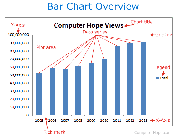
In general, a chart is a graphical representation of data. Charts allow users to see what the results of data to better understand and predict current and future data. The picture below contains an example of a column chart displaying the number of unique visitors Computer Hope has received between the years of 2000 and 2006. In this example, you'll notice a gentle increase of users without reading any data.
In Microsoft Excel, pressing Alt+F1 inserts a chart.
Types of charts
There are a wide variety of charts available to display data. The list below contains those that are popular and supported by many programs.
- Area chart
- Bar chart
- Column chart
- Excel sparklines
- Flow chart
- Gantt chart
- Graph
- Line chart
- Pie chart
- Point chart
- Scatter chart
Embedded chart vs. Chart sheet
In Microsoft Excel and other spreadsheet programs, there are two types of charts: an embedded chart and chart sheet. An embedded chart is a chart object that can be inserted into a worksheet. A chart sheet is a chart that is a sheet of its own.
To insert an embedded chart, use the Insert option in the spreadsheet program you have available to you.
To insert a chart sheet, right-click the worksheet tabs at the bottom of the worksheet and click Insert and then Chart.
Axis, Histogram, Spreadsheet terms, Statistics, X-axis, Y-axis