Scatter chart
Also called a correlation chart, scatter graph, scatter plot, or XY graph, a scatter chart is a diagram used to display two variables (X and Y) for a data set. When placed on the chart, these points help determine if there's a relationship between the two variables and whether any outliers exist.
If the data points of the two variables are correlated, they fall along a positive (up) or negative (down) line or curve (often known as a trendline). Also, correlation is based on the proximity of the dots to one another. For example, if the data points are tightly clustered, there is a strong correlation. If they are scattered and disparate, this is said to be little or no correlation.
If the scatter chart shows a correlation, do not assume that only one variable caused the correlation. There may also be a third variable that influenced the other two.
Scatter chart example
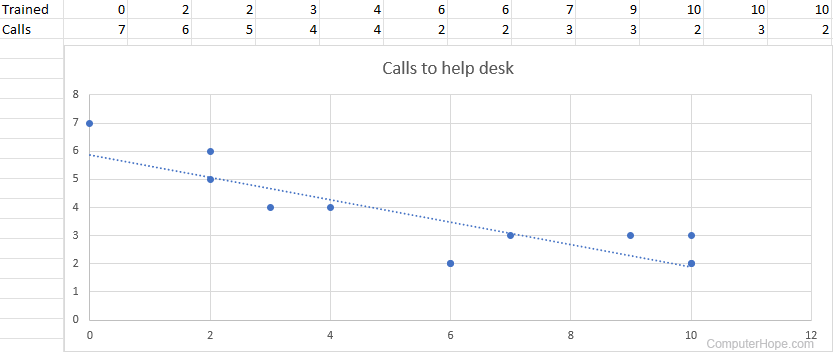
Below is an example of how a scatter chart may appear in Microsoft Excel. In this example, we have two related variables: the number of trained employees and the number of calls the company's help desk received from them each day. As the dotted trendline indicates, the help desk received fewer calls as more employees were trained.